EtonHouse
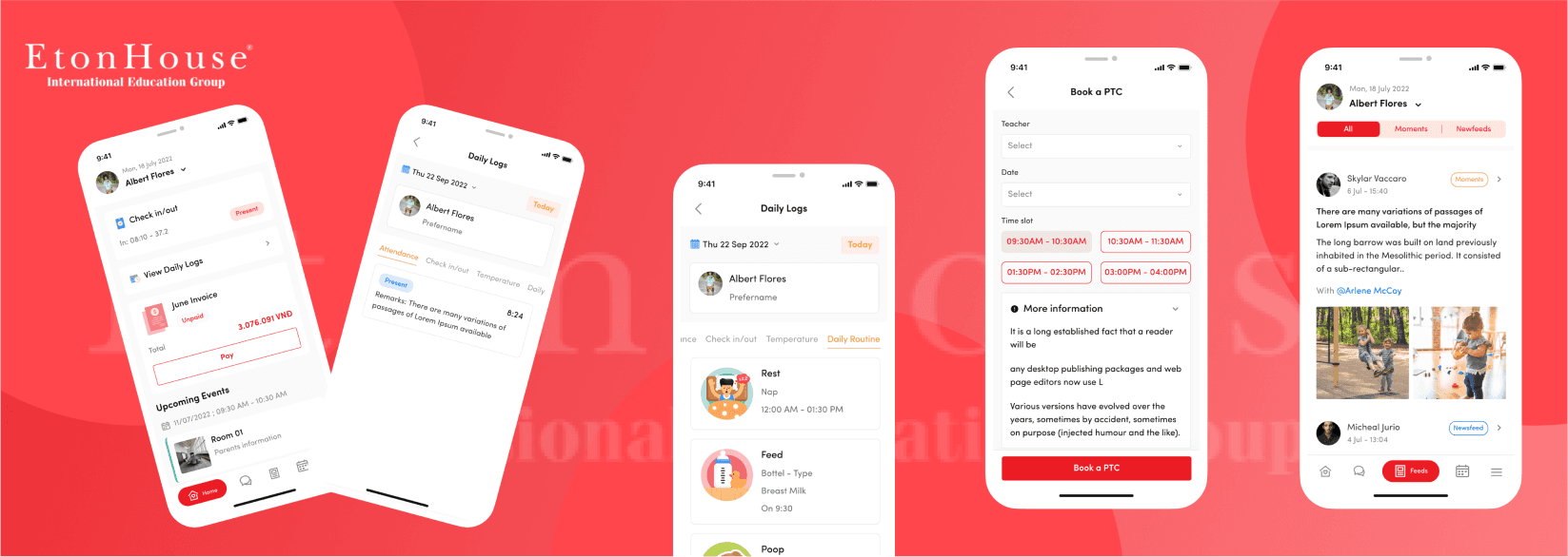
The EtonHouse App is a transformative project designed to enhance communication between teachers and parents within the EtonHouse school community
This innovative app serves as a dedicated platform, facilitating seamless interaction and ensuring that parents stay consistently informed about their children's activities at school. Through this user-friendly application, teachers can efficiently share updates, progress reports, and important information, fostering a more connected and engaged educational experience.

Role
UI/UX Designer
UI/UX Designer
UI/UX Designer
Market
Singapore, HongKong
Singapore, HongKong
Singapore, HongKong
Industry
EdTech
EdTech
EdTech
Platform
IOS/CH Play
IOS/CH Play
IOS/CH Play
Challenge
The customer has not had any prior mobile applications, managing the system relatively manually.
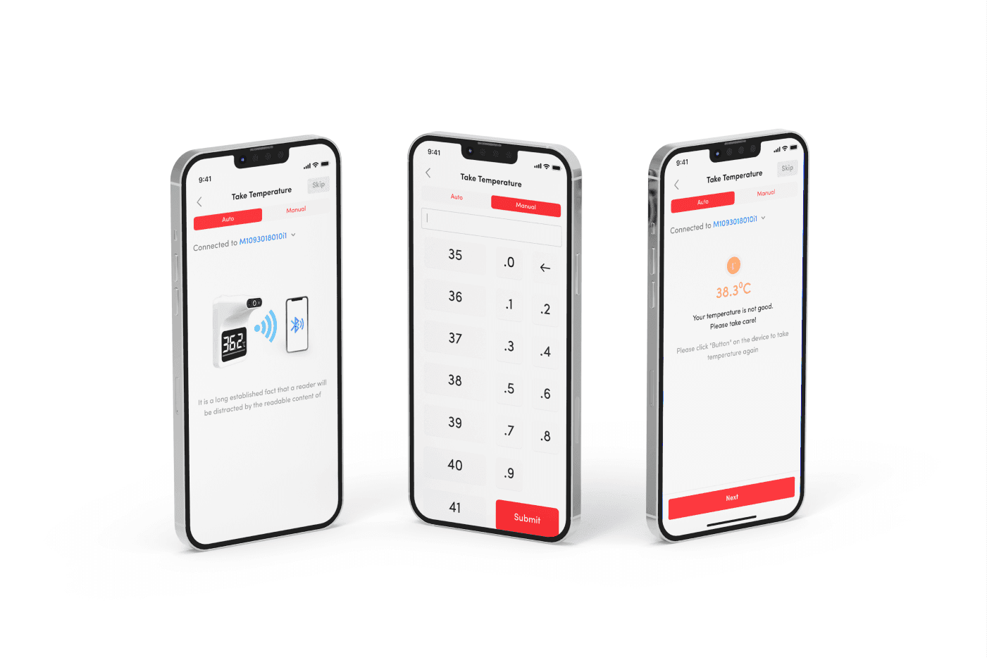
After Covid, schools and parents are increasingly concerned about health issues and want to monitor their children quickly and accurately.
Instead of sending notifications through chat groups or phones, EtonHouse wants a feature like a social network between the school and parents.
EtonHouse aims to develop two applications for parents and teachers with synchronized data.
The customer has not had any prior mobile applications, managing the system relatively manually.
After Covid, schools and parents are increasingly concerned about health issues and want to monitor their children quickly and accurately.
Instead of sending notifications through chat groups or phones, EtonHouse wants a feature like a social network between the school and parents.
EtonHouse aims to develop two applications for parents and teachers with synchronized data.
Discover
Research methods:
Due to the limited time available for the research process, I mainly rely on insights shared by customers (who are also the employees currently working at the school, including teachers and admin staff).
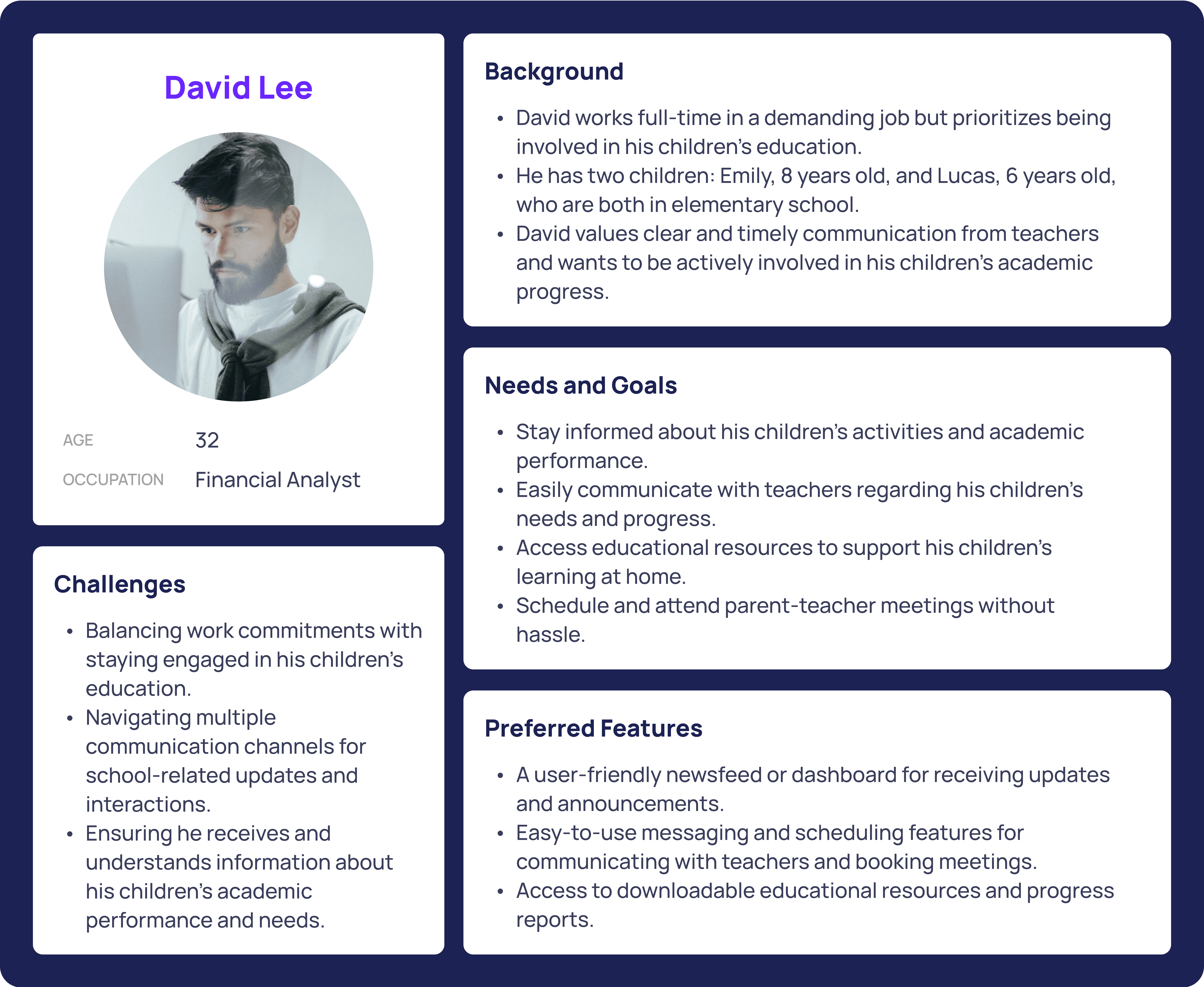
The customers have shared their daily trial experiences with their CRM system, which allows the entire team to understand the issues, categorize the requests, assess the features, and gather problems to develop Proto Personas (primarily based on customer feedback).
Research methods:
Due to the limited time available for the research process, I mainly rely on insights shared by customers (who are also the employees currently working at the school, including teachers and admin staff).
The customers have shared their daily trial experiences with their CRM system, which allows the entire team to understand the issues, categorize the requests, assess the features, and gather problems to develop Proto Personas (primarily based on customer feedback).

Define
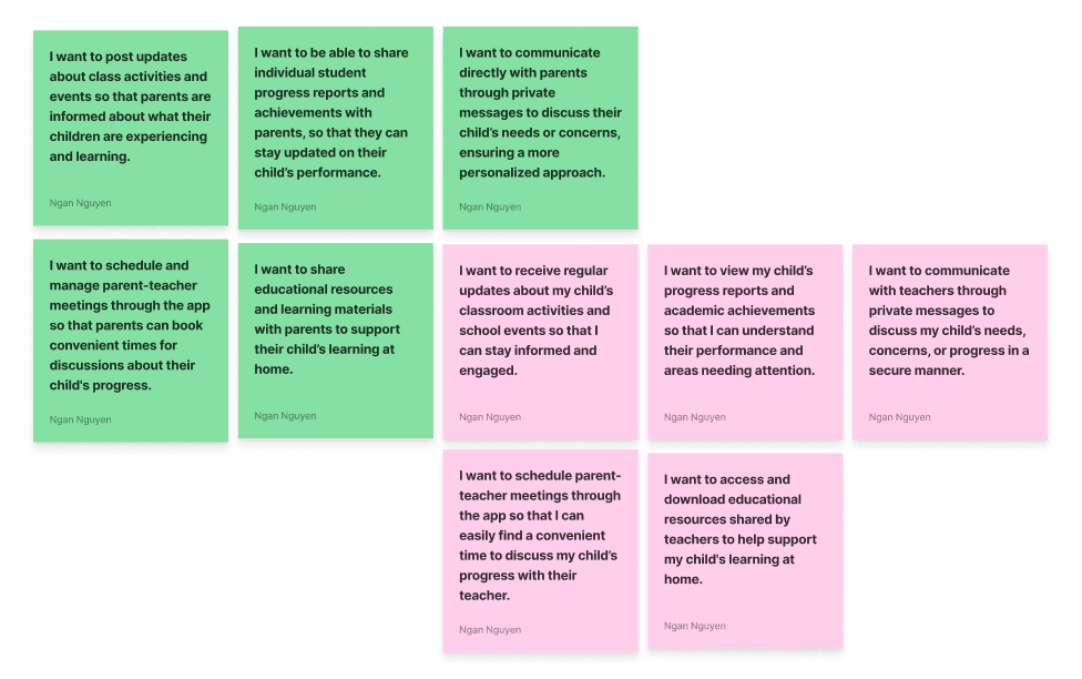
Problem Statement: At this stage, both the team and I have envisioned the outline of the user personas and the issues that need to be addressed, prioritized accordingly
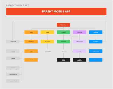
Information Architecture: Based on the research findings, we revamped the app’s navigation and content, prioritizing features and information to better meet user needs.
Business Requirements: The BA and I will list out the prioritized user stories to be addressed. Based on this, the PM will make decisions together with the client, considering the budget, timeline, and available resources.
Problem Statement: At this stage, both the team and I have envisioned the outline of the user personas and the issues that need to be addressed, prioritized accordingly
Information Architecture: Based on the research findings, we revamped the app’s navigation and content, prioritizing features and information to better meet user needs.
Business Requirements: The BA and I will list out the prioritized user stories to be addressed. Based on this, the PM will make decisions together with the client, considering the budget, timeline, and available resources.
Develop
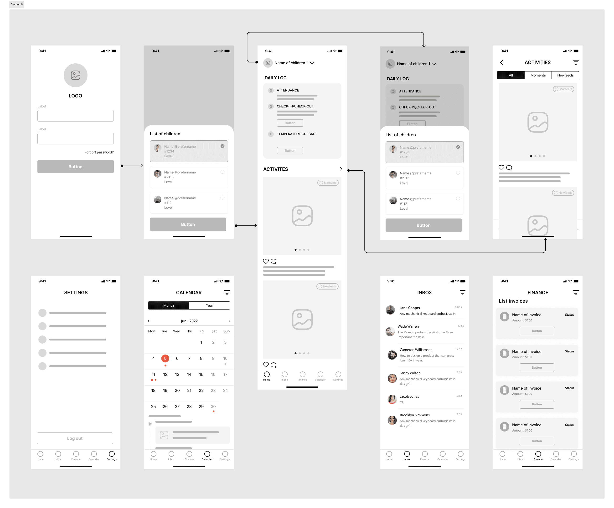
Wireframe & Prototyping: We created low-fidelity wireframes to visualize the new layout and navigation, refining them iteratively based on user feedback. Subsequently, we developed a high-fidelity interactive prototype to test the design
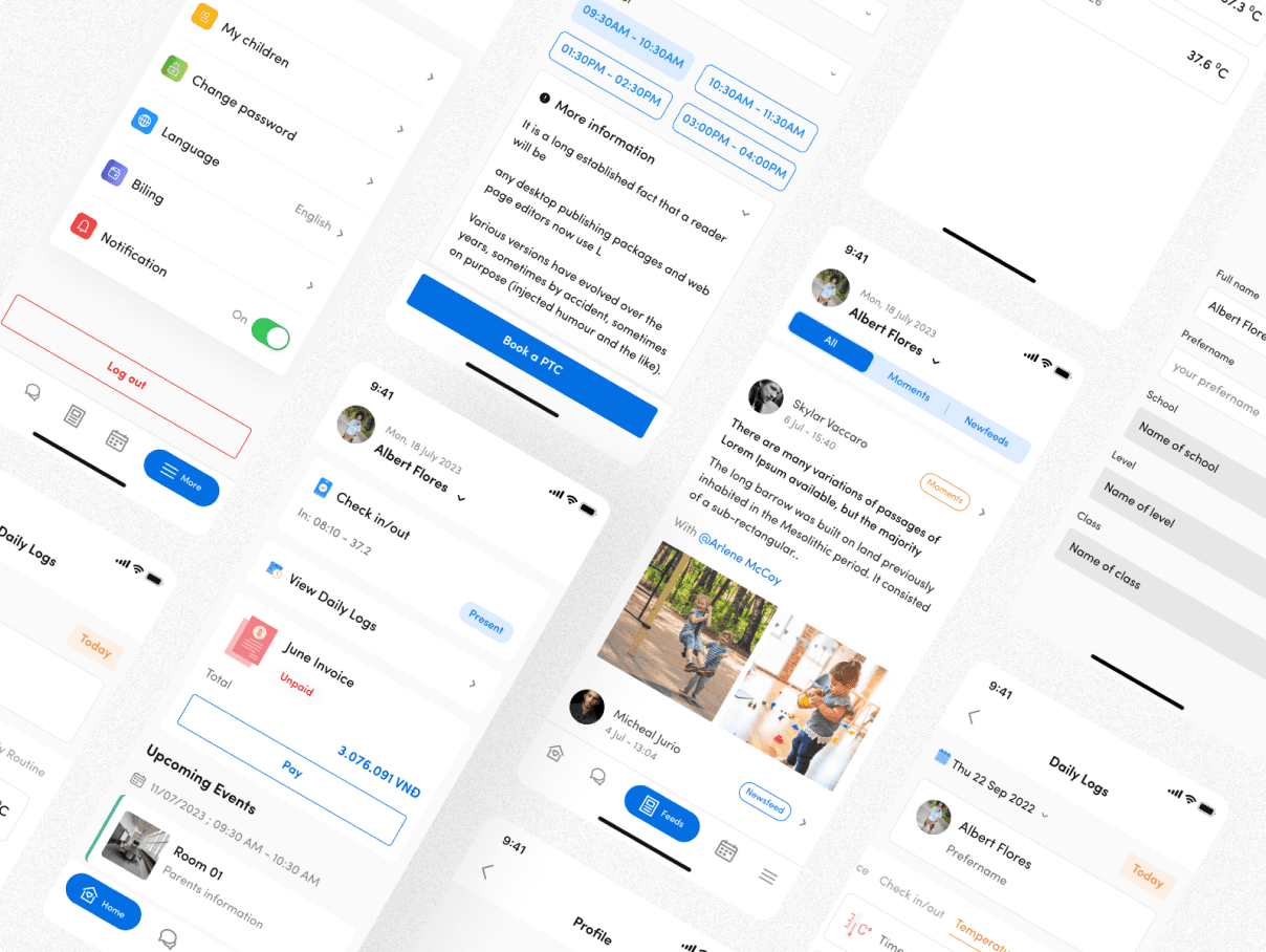
Build Style Guide: We developed a cohesive visual language and mascot collection, including color schemes, typography, and iconography, ensuring consistency throughout the app and for future updates.
IA & User flow: Teamwork with BA, PM/PO to create IA/User Flow/Sitemap.
Collaboration: We collaborated closely with developers and product managers throughout the design process. Their insights and feedback were instrumental in shaping the design. Developers provided technical feasibility assessments that informed design adjustments, while product managers helped prioritize features and align the design with overall product goals. This collaboration ensured that our design was both practical and aligned with the broader vision, leading to a more cohesive and effective final product.
Wireframe & Prototyping: We created low-fidelity wireframes to visualize the new layout and navigation, refining them iteratively based on user feedback. Subsequently, we developed a high-fidelity interactive prototype to test the design
Build Style Guide: We developed a cohesive visual language and mascot collection, including color schemes, typography, and iconography, ensuring consistency throughout the app and for future updates.
IA & User flow: Teamwork with BA, PM/PO to create IA/User Flow/Sitemap.
Collaboration: We collaborated closely with developers and product managers throughout the design process. Their insights and feedback were instrumental in shaping the design. Developers provided technical feasibility assessments that informed design adjustments, while product managers helped prioritize features and align the design with overall product goals. This collaboration ensured that our design was both practical and aligned with the broader vision, leading to a more cohesive and effective final product.

Deliver
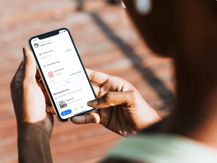
Visual Design & Style Guide: The client already had a brand identity, so I used that to create a moodboard, following the design pattern and style guide to maintain consistency throughout the product. Since we needed to develop two applications for two different roles, I aimed to maximize the reuse of components to save effort for the development team.
User Feedback: The Figma link was shared throughout the process, from wireframe development to handoff. Weekly demo sessions with the client also served as opportunities for the team to gather feedback and make continuous updates each day, ensuring that all tasks stayed on track.

Impact
The entire team delivered on schedule, meeting the requirements adequately
The product is operational and meets the minimum requirements for an MVP
The entire team delivered on schedule, meeting the requirements adequately
The product is operational and meets the minimum requirements for an MVP
The entire team delivered on schedule, meeting the requirements adequately
The product is operational and meets the minimum requirements for an MVP

Reflection
Here is the feedback I received after handing over the project.
1.Speed (e.g x point /5 points) - 5
2.Quality (e.g x point /5 points) - 4
3.Delivery as expected: (e.g x point /5 points) - 4
4.About result after update feedback (e.g x point /5 points) - 5 5.Covered business expectations rate (e.g x point /5 points) - 5
6.About communicating (e.g x point /5 points) - 5
7.If you have something to share to improve my skill, please kindly to write your thought. (Optional) ---- UX Design can still be improved
These are important points that I need to note in order to further improve, particularly in terms of UX, to make it more user-friendly and convenient for both user roles